A Pivot Table is a conceptual data structure used to summarize, reorganize, and analyze multidimensional data. It is a powerful abstraction for transforming raw tabular data into meaningful insights.
It works by grouping data along one or more dimensions and applying aggregation functions (like sum, count, average) to the grouped values.
A pivot table is smart summary of your data. It is used to identify patterns in your data. Instead of counting or adding things up manually, a pivot table does it for you, automatically grouping and calculating the numbers based on what you care about.
It helps you spot trends, compare categories, and make decisions faster.
Components of a Pivot table
Component |
Description |
|---|---|
Rows |
Categories or dimensions used to group data vertically |
Columns |
Categories or dimensions used to group data horizontally |
Data |
Aggregated metrics (e.g., totals, averages) calculated for each row-column pair |
Filter |
Criteria used to include/exclude data from the summary |
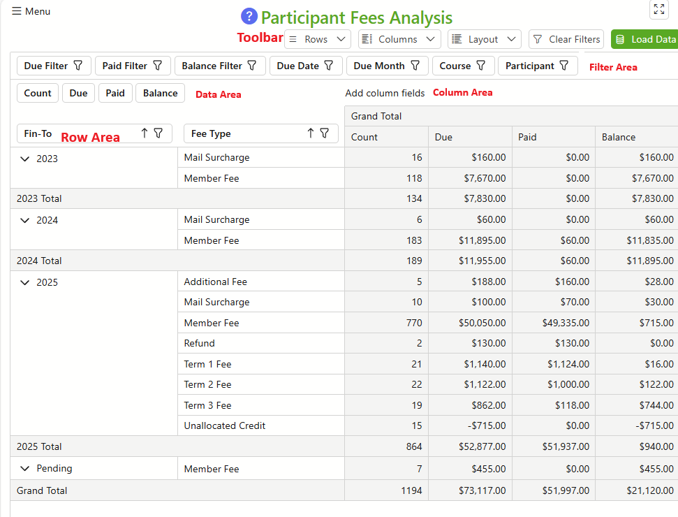
These components are represented on the Pivot Table as Areas as shown in the image below. Items in the Filter Area can usually be dragged to to the Column or Row Areas and vice-versa. Items in the Data Area can be moved to the Filter Area. The effect of moving an item to the Filter Area is to remove that item (Dimension) from the aggregation.
Suggested Workflow
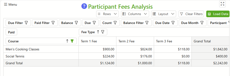
It is usually a good idea to start with a summarised view of your data such as that displayed above. A summarised view will quite often highlight anomalies or insights into your data. Then, rearrange your dimensions to obtain the analysis you want.
For example, below is the same data as above but rearranged to show Course fees paid for each term. Moving the Participant dimension to the Row Area would show the fees paid by each student in the course.